
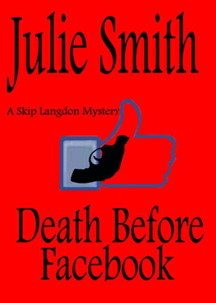
It’s been quite a while since I did a Teaser Tuesday post, even though the whole reason I started posting on Tuesdays was that I discovered “Teaser Tuesday” is a thing and I figured I could fall back to it on weeks when I didn’t have anything else to write about, so I decided it was about time to trot one out ― not because the book I’m currently reading is any great shakes, but it has a couple of interesting things to recommend it. That book is a Skip Langdon mystery1 called Death Before Facebook, by Julie Smith; or at least, that’s what it’s called now.
Continue reading “Teaser Tuesday: “Death Before Facebook””Tag: cell phones
Teaser Tuesday 5/20/2014: “Jazz Funeral”
So this week I’m reading Jazz Funeral, by Julie Smith, a murder mystery set in New Orleans. This is book #3 in a series featuring detective Skip Langdon. Since I got it for free off the BookBub mailing list, I didn’t have the luxury of going back and starting at book #1, but so far that doesn’t seem like a big deal.

Teaser Tuesday 10/22/2013: “Sunglasses After Dark”
This week I’m reading the vampire genre classic Sunglasses After Dark by Nancy Collins, which has been edited, reformatted and quasi-updated in a Kindle edition. Why “quasi-updated”? Well there are sporadic references to modern trifles like cell phones (and even an iPhone reference was dropped in), but nobody has a computer and I don’t remember anyone doing a Google search so far in their efforts to locate missing heiress Denise Thorne (who is now the vampiric vampire hunter Sonja Blue), which betrays the book’s late 1980s/early 1990s roots. I’m not complaining (though a number of Amazon reviewers are), since I did something similar with my vampire novel Long Before Dawn, updating it just enough to hand-wave away the fact that if everyone just had their cell phones turned on, the whole vampire hunting thing would have gone a lot more smoothly. But then, if vampire-hunting goes smoothly, what fun is that?
Continue reading “Teaser Tuesday 10/22/2013: “Sunglasses After Dark””
Laying Out A Book Isn’t As Easy As You’d Think
So I got the printed version of my first stab at a Lulu book and, as a book, it looks surprisingly good — quality binding, nice solid feel to the cover, good weight to the pages, dark and legible text inside. The problem is, the interior looks like one of the manuscripts that I print out when I’m editing. It quite frankly didn’t occur to me that I would need to:
- Change the font from courier to something reader-friendly
- Add the page numbering and book title in the header and footer
- Replace underlining with italics
- Insert the sort of pages you typically find at the beginning and end of a book — you know, a little blurb, a title page, a copyright page.
- Turn off double spacing, for crying out loud … jeez, what am I, a moron?
Also, the margins are too close to the inner binding, but that’s not on the list of things that didn’t occur to me, because it did. I just didn’t make them big enough. I’m correcting all these things and getting ready to try Lulu Book Revision 2. I expect this one to look nicer, but there will probably be a couple more iterations before it’s ready to go.
For anyone who’s waiting with bated breath for this to be ready (i.e., no one), I’ll drop you a teensy tidbit … it’s a vampire novel set in the mid or late 90s. It was actually written in the early 90s, but later updated to account for the newfound popularity of cell phones. (I am not, however, going to be updating it to account for wireless Internet, camera phones, etc. I have to draw the line somewhere.)
