
So just before the end of 2016, I finally finished what is surely almost definitely probably the final major editing draft on Television Man, my dark fantasy novel which is sort-of set in the Adirondack park of upstate New York.
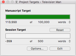
And you know what that means: It’s time to prepare and lay out the ebook and dead tree versions. It’s not as easy as one might think.
Of course, you can’t have a book without a cover, and you can’t have a cover without artwork. Well, you can, but, booooring. For instance, which cover for Catherynne Valente’s Palimpsest (one of my favorite books that I read in 2016) is more likely to catch a reader’s attention?


If you said the one on the left, then, hmm, maybe you play a lot of checkers or really like tablecloths or something. But I digress.
So, anyway! Having probably maybe definitely finished editing, the next order of business was to obtain cover art. Which I do not create myself, because Jim Can’t Draw.

Ever since I saw it, I’ve had my eye on a particular piece, “The Unknown“, by Émilie Léger, who, of course, provided the cover art for both books in the Strings duology:


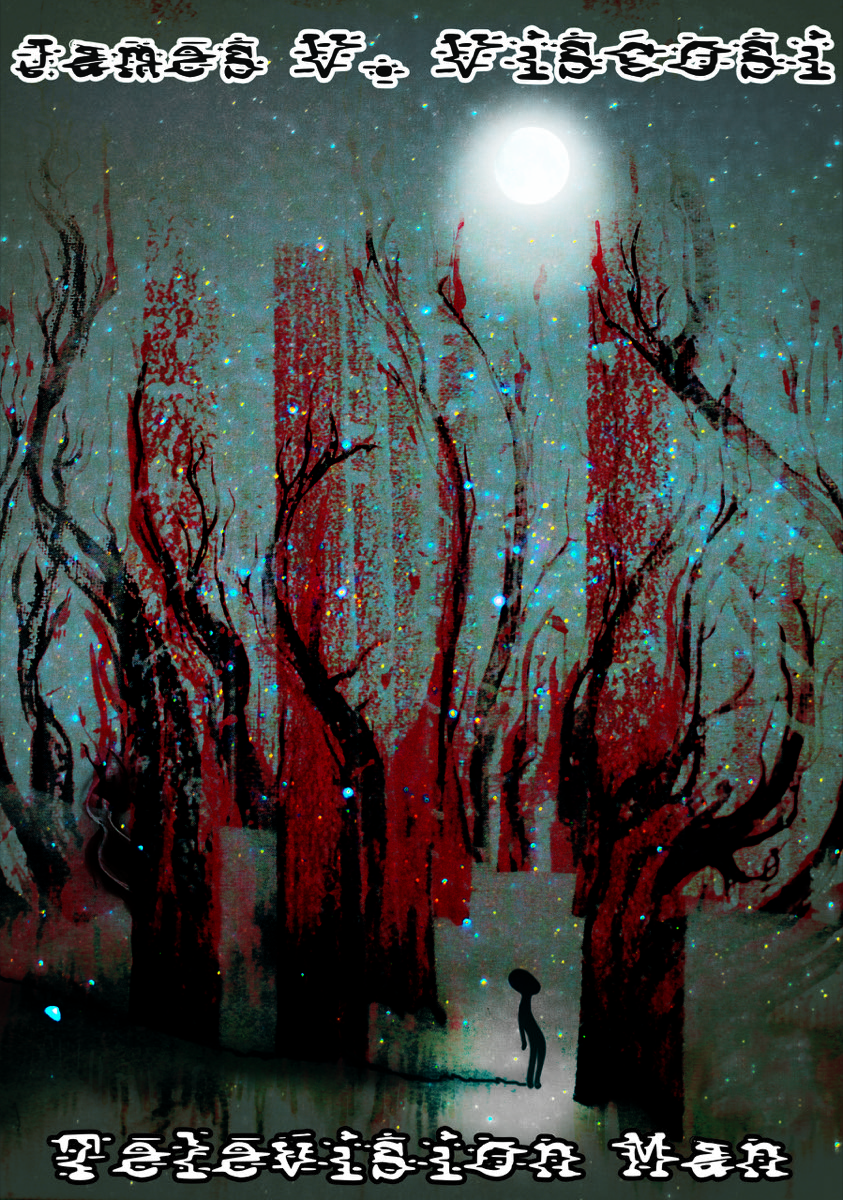
Non-exclusive rights to use “The Unknown” having been obtained, I am now in the process of adapting it for the cover. Of course, I need a font that complements the nature of the book. For Strings, I went with one that looked sort of like the letters were flaking apart and falling to pieces, to reflect what was happening to the world in which (most of) the action took place. For Television Man, I wanted something kind of television-ish, kind of staticky, kind of distorted. Like this:

I went with black lettering up by the moon and white lettering down in the shadows, because, well, that’s how things seem to end up in Television Man — a little bit backwards. I’m happy with the readability of the white text, but I’m not quite sure on the black text. Maybe making them both white would be better:

That is, I think, more readable, but I like the contrast of the black vs. the white. Perhaps a thicker stroke on the font is what’s needed:
Hmm, not sure I like that either. And actually, the original black and white text looks just fine, at least in the Kindle previewer:

Of course, the paperback version will be in color, and it will have a front and a back. In the past I’ve had a single-color back cover, but for this one I thought I would use the cover image again, but inverted in some way. I tried making it upside-down:

But, hmm, the upside-down version might be a little too “Stranger Things“. I think I like it just flipped horizontally instead:

Decisions, decisions, decisions …

Ooh, how exciting, picking out a new cover! I like the first one the best, with the black lettering on top and the white on the bottom.
LikeLiked by 1 person
Me too! I have a paper copy on the way — we will see how it looks in dead tree form!
LikeLike